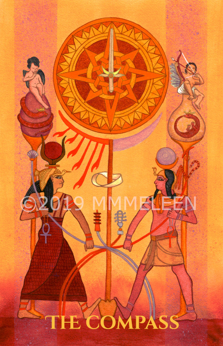
This one has been a struggle. This is the third version and still not totally pleased with it, but I do like it better than the first two. I think the Golden Dawn color scale colors for this one are tricky to work with. Orange, Pale Mauve, New Yellow Leather, Reddish Grey Inclined to Mauve.
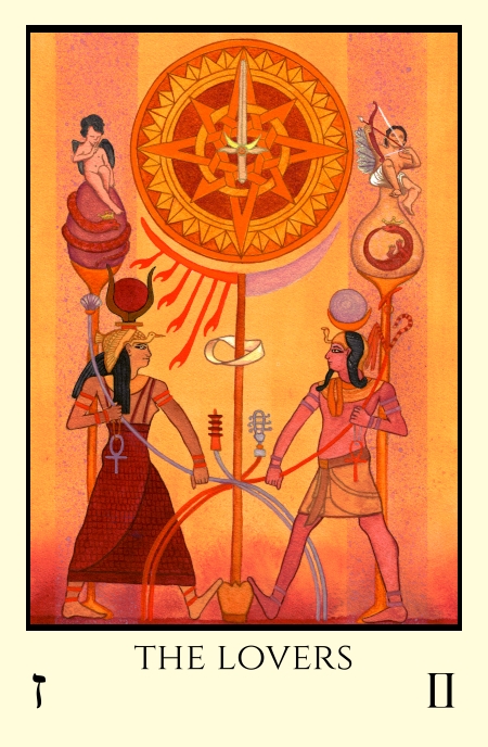
For now though, unless I scrap and redo the design completely, here it is. The Lovers here are portrayed as solar goddess Hathor and lunar god Khonsu, who in a creation myth from the Ptolemaic Period (332–30 BC) mated to create the world. Here they divide and intertwine, exchanging his Djed for her Sistrum. The Hebrew letter for the card means “sword” and the sword is shown as the needle of the Compass. The Lovers card often indicates making a choice, symbolized by the direction finding compass needle.


It may be a trick of the eye, but the whole seems to tilt down from the left side of the image to the right. Also, the textures and components on the left side seem heavier/more dense (perhaps this is intentional). The compass appears to rest on the sun moon “stanchion” and as rendered/shaded may be too visually heavy to sit atop so slender an object. Maybe these imbalances are part of what is troubling you?
Wow!