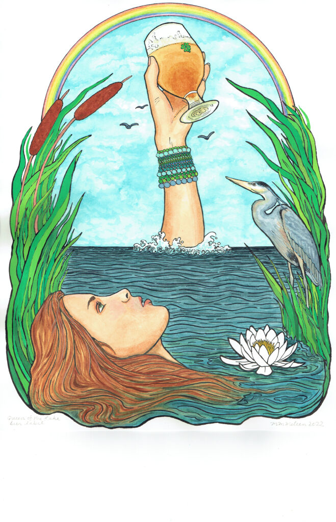
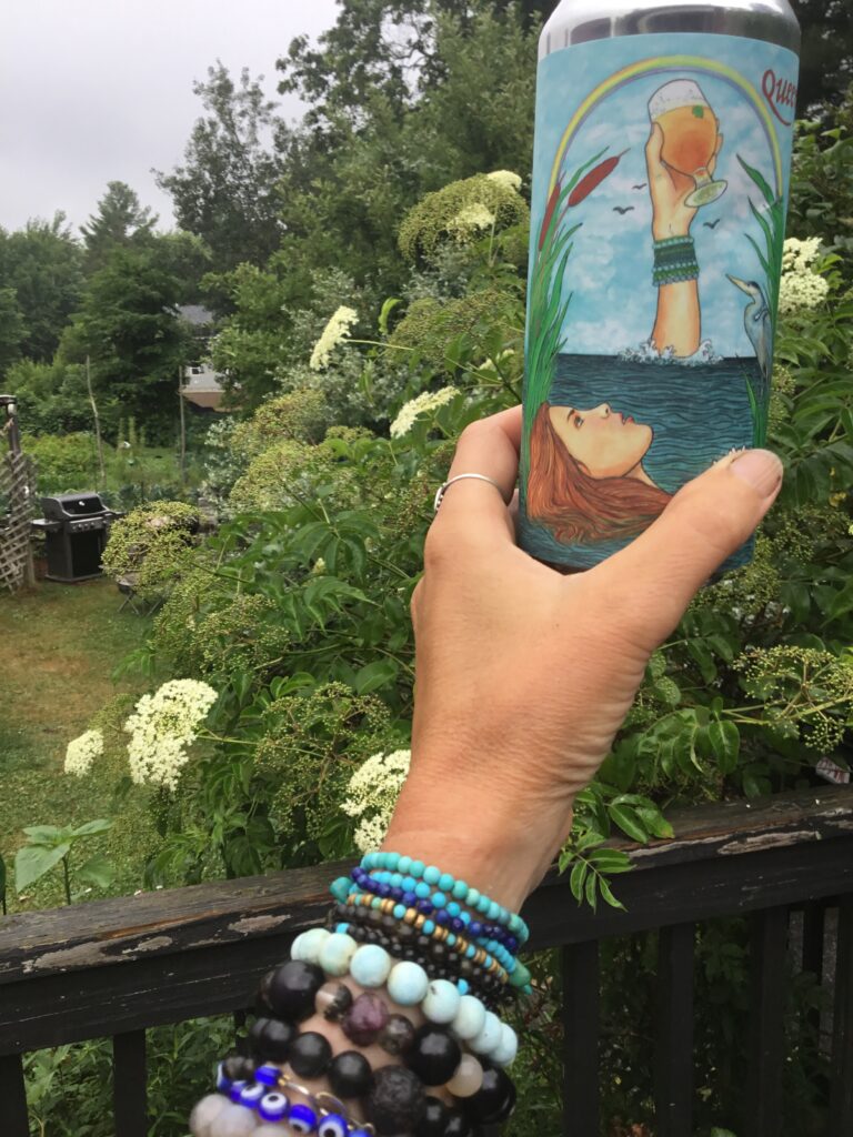
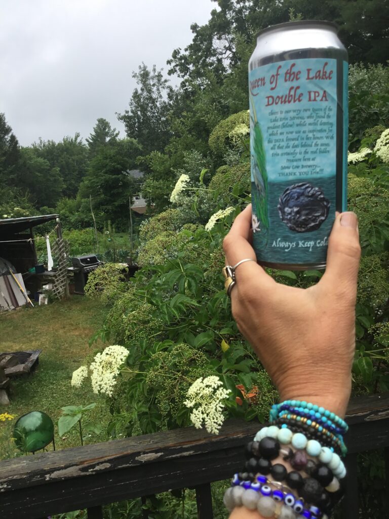
This was a fun label to make. The brewery owner’s mother has a passion for metal detecting, and her prize find was a small silver medallion with a “Lady of the Lake” theme, showing a woman floating in a lake, with some cloud-swirls, reeds, lotus flowers, and possibly a heron in the reeds, though it’s pretty hard to see. The brewery wanted to do a label in her honor, for a double IPA they just released this week, appropriately enough during the watery sign of Cancer.
So far the labels I’ve done have had an air theme (Tranquil and Alert), a fire theme, (Alchemy of Smoke), a future release with an earthy theme (All Nighter), and this one has a water theme (Queen of the Lake).
So I used the medallion design for inspiration for a design done in ink and of course, watercolor. I added the hand (not on the medallion) to reference the Lady of the Lake, who usually offers up the sword Excalibur but here is offering a chalice of beer instead, from taking a picture of one of their brewery’s IPA glasses, with the hand of yours truly raising a pint. They were so happy with it, and said that not only was it their best label, but their favorite label of any beer of any brewery, which was quite a compliment!
The pictures below show the original art, the finished can, and the side of the can were they also put a small photo of the silver medallion that inspired the design.


Here’s to a happy summer!

WOW! It came together beautifully!