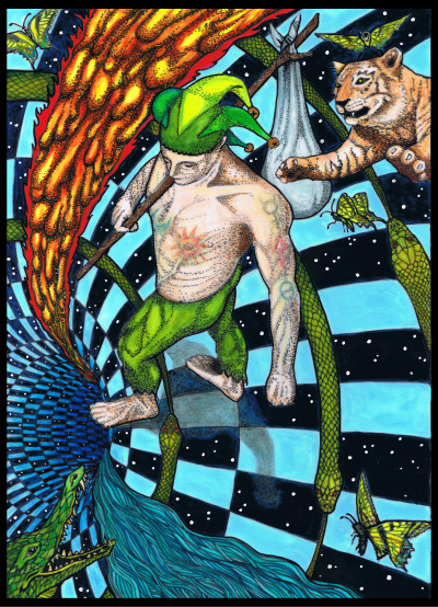
Above image: The Aeon card from Pharos Tarot, copyright 2018-2020 M.M. Meleen
Crowleymas, Stardate 2020. ☉︎ in 19° ♎︎ : ☽︎ in 23° ♌︎ : ☽︎ : Ⅴⅴⅰ
It was the best of times, it was the worst of times, it was the age of wisdom, it was the age of foolishness, it was the epoch of belief, it was the epoch of incredulity, it was the season of Light, it was the season of Darkness, it was the spring of hope, it was the winter of despair, we had everything before us, we had nothing before us, we were all going direct to Heaven, we were all going direct the other way—in short, the period was so far like the present period, that some of its noisiest authorities insisted on its being received, for good or for evil, in the superlative degree of comparison only. ~ Charles Dickens, A Tale of Two Cities
“It was the best of times, it was the worst of times…” indeed. Ah hell, who am I kidding…it’s 2020, and we all are just waiting for it to be over. For it seems that several years ago (you can guess around when, can’t you?) we passed through a terrible portal: our Earth became square and renamed “htraE” and for sure we are now in a Bizarro world, filled with anti-heroes. But there is an end in sight that might return us to a round earth…I’ll say no more.
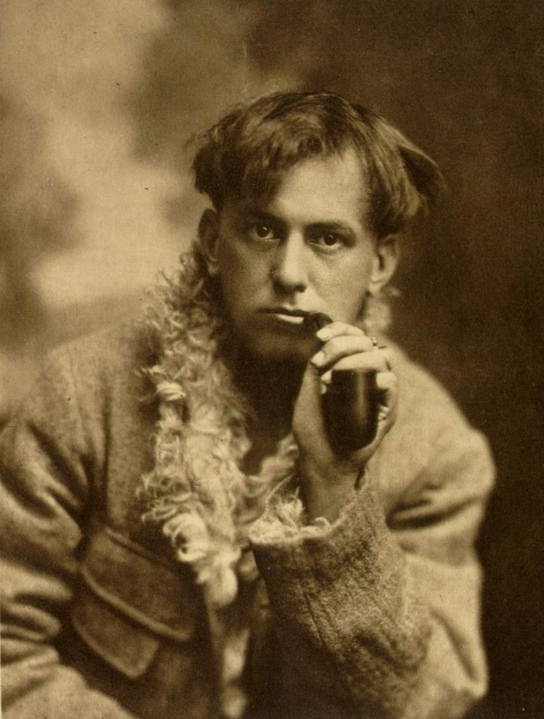
Today however, is a day for celebration: Crowleymas, a Feast for the Beast, on this the 12th of October and the 145th anniversary of the birth of Aleister Crowley in 1875. It’s a day to re-calibrate and reflect on where and when we are, and how to align our path with our True Will.
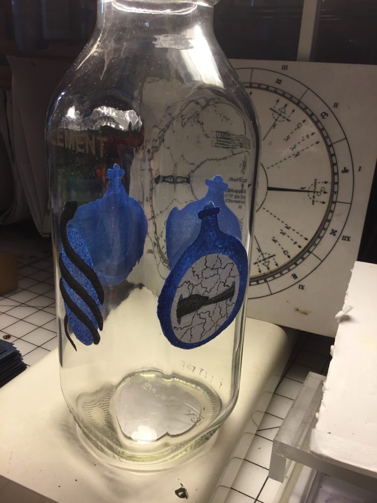
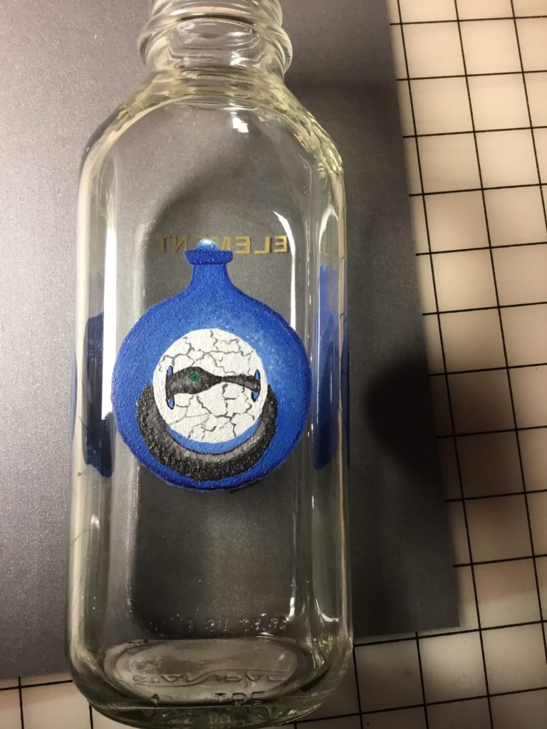
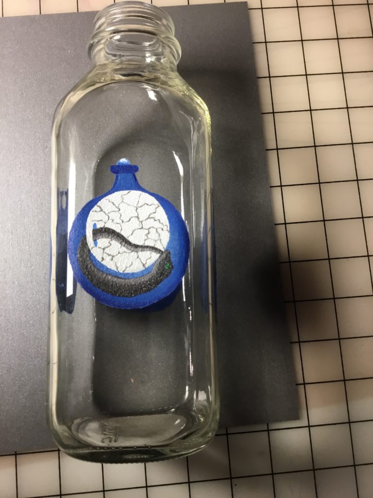
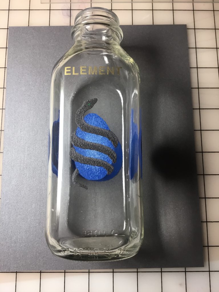
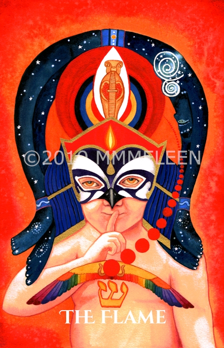
In spite of how crazy the world is, how full of terrors and divisions, how isolating and lonesome it sometimes feels, today anyway, I feel pretty good and ready to embark in earnest on a new series of tarot artwork inspired by the something in one of the many books of the one and only To Mega Therion.
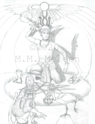
Tomorrow, October 13, trickster Mercury goes retrograde at 11°40 Scorpio, and it stations direct on November 3 (election day!) at 25°54 Libra. While we all know that Mercury retrograde periods and changes of direction can coincide with periods of chaos in Mercury-related things, retrograde periods can be good for RE-visiting things, RE-turning to projects or things that were first started in the past. I’m returning to work tomorrow on several projects that were begun in prior periods. I mentioned two of the decks I’d begun and then abandoned in a prior post. Both of those will be revisited and worked on during this period, but I feel most inspired by the one you saw in that post with the pencil sketch of the Magus card. So tomorrow I’m really looking forward to digging in and beginning to paint the Fool card from that deck.
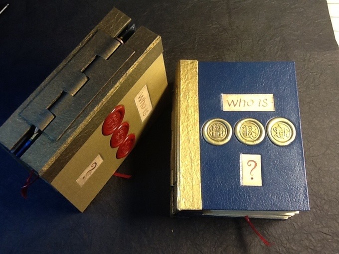
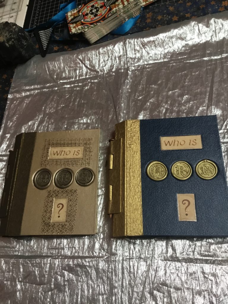
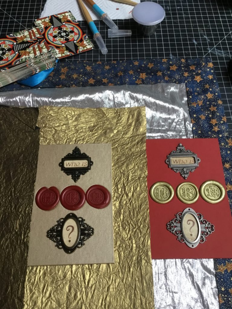
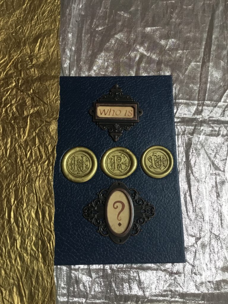
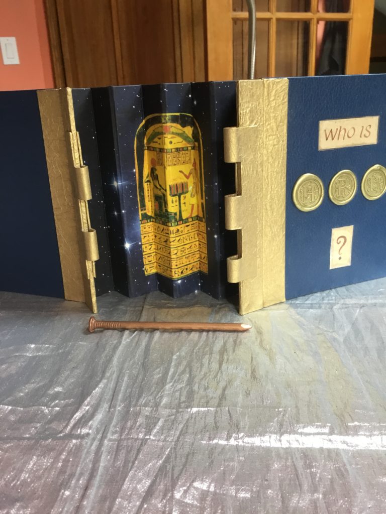
I’m also revisiting something I didn’t expect to. Remember the “Who is HRU?” handmade esoteric pop up books that hold the extra large major arcana cards? I originally intended to make a limited edition of 22 of them, but soon realized that there WAS NO WAY IN HELL that I was going to be able to stand making that many, as with at least 26 hand cut pop up mechanisms inside each book it is just way way way too much work, and even charging hundreds of dollars for one means working for a long time for a lot less than minimum wage. So I only ended up making numbered copies I thru III, plus an artist’s reference model for myself that I labeled “zero”. So currently only 4 copies exist: numbers I thru III and including my own working model, 0.
But since someone has persisted in asking for another copy to be made, and I still have all of the diagrams and notes I made on how to make the pop up mechanisms and even had a few covers and parts started and abandoned, I finally (probably against my better judgement) decided to at least finish a couple more complete pop up books, and use the covers that were made that don’t end up as full fledged pop up books to make some cool handmade books. So the “Who is HRU?” book will probably end up as a series of only copies I thru either V or VI, plus my 0 model. I think I can probably force myself to finish two or maybe three more, but then that project will be shelved, probably for good.
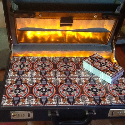
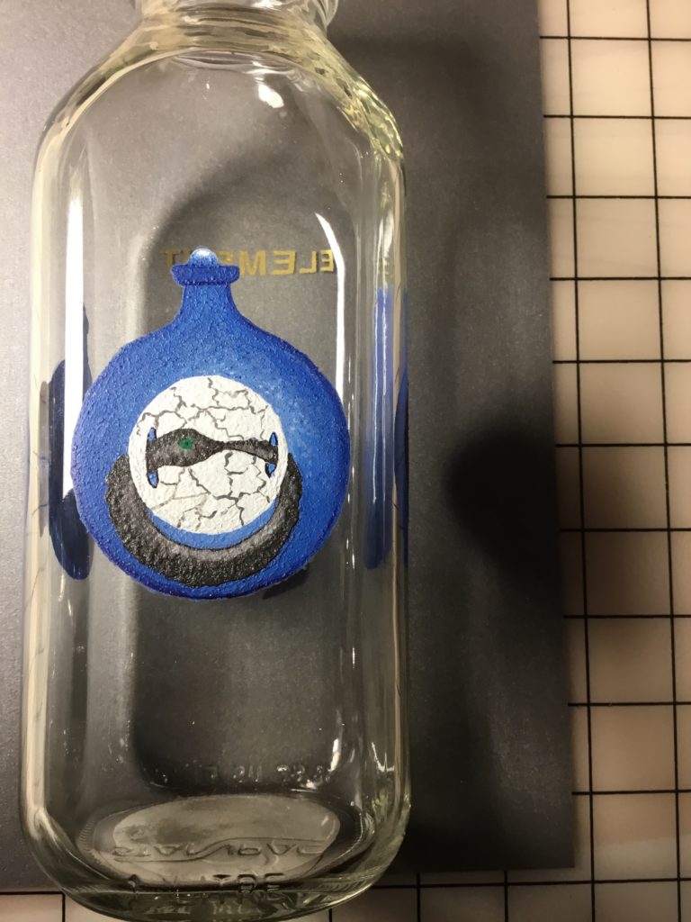
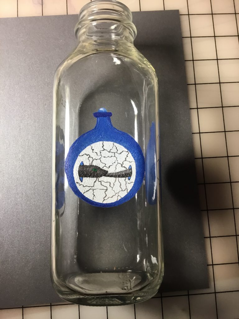
Here are some pictures of the partially made covers in progress. Some of them will likely just end up being journals, while a few may make it to fully functional pop-up books. The last picture shows the secret panel with the Stele of Revealing that is hidden inside the book’s hinges.
Yesterday, we recorded new episodes for our current zodiacal series on the Fortune’s Wheelhouse podcast – including the one for my own sun sign Sagittarius which airs this Wednesday. Today was tying up loose ends, posting about our next episodes and giveaways on the FW Patreon site, and getting the art studio ready for action. For tonight, I’m going to select a few verses at random from Liber AL, the Book of the Law with a random number generator, and try to divine from them while raising a Brown Derby (the cocktail, not the hat) to Uncle Al, and maybe a feast involving some homemade egg rolls. Tomorrow, a REVIVAL and RE-turn to ART to art. Here’s to a round Earth in our future.
Remember to VOTE! Round Earth 2020!