That is the question.
See the bottom of the page for a POLL after the examples.
Since all the Majors of Pharos Tarot are done now and I’m not planning on doing the minors yet, I’m deciding whether to publish them as Majors only, and if so, in what format. The size would be large, 4×6.25 inches. But they could work in that size either as bordered or borderless cards.
The Pharos images were designed so that they could be bordered or borderless. They have enough extra bleed and length that they could be completely borderless, but the important parts of the image are centered in a same-sized area so that they could be cropped and bordered.
Here are a few roughs of what the Pharos deck might look like with borders. For now I just put them into the Tabula Mundi tarot’s borders to see how they would look. So below see how they might look as bordered, with traditional titles, vs. borderless, with alternate titles.
Note these colors and fonts and border styles are all subject to change. This is just to compare the look in general.
Note also that even though the borderless art looks bigger in one version of the Fool, there is also a way to crop these with the art the same size as the borderless, placing the image more to the edges of the frame. The second Fool below shows the art cropped closer but larger. The first shows more of the overall image. So there are different ways to do the bordered cards, it’s just deciding whether or not to have borders.
I like the look either way. But bordered has the advantage of being more protective of the art, which can chip at the edges in a more noticeable way on borderless decks.
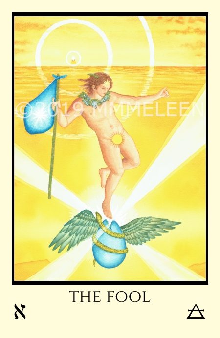
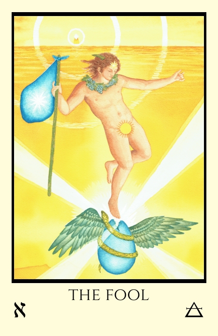
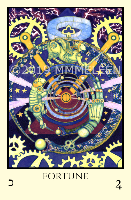
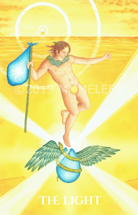
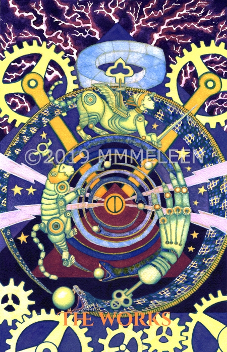
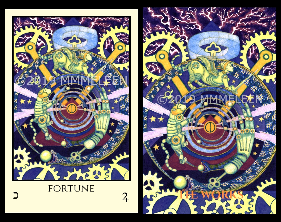
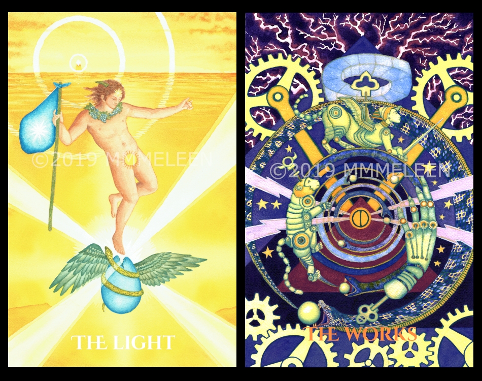
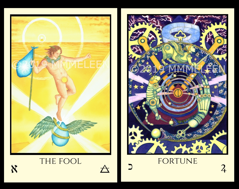
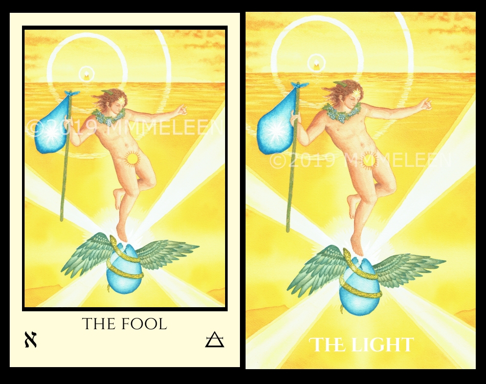
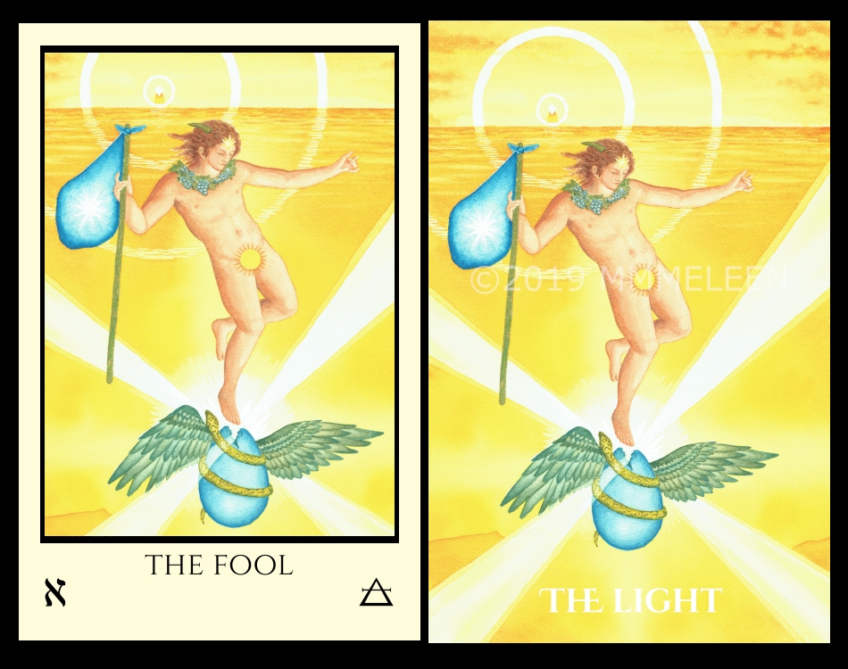
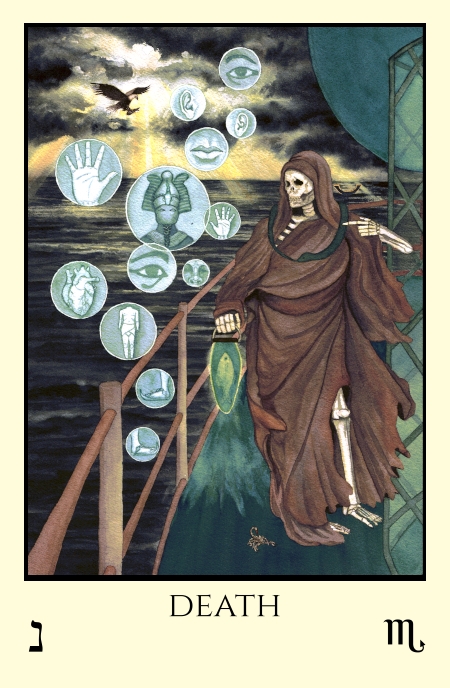
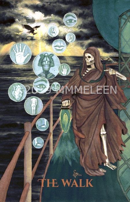
We also have to decide on traditional Thoth based titles or the alternate Pharos concept titles. (And whether or not Lust should wear the “Scarlet Woman” dress or be naked!) It’s a wonder anything ever gets done as I’m pretty indecisive sometimes.
To see the alternate titles check the Pharos home page.
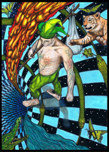
My preference would actually be almost borderless, with no titles. In other words, just the raw images. This way you get the most estate for the image, without any text blocking any part of it, and the very narrow border would preserve the integrity of the image from the expected edge wear. Titles and qabalistic/astrological correspondences can be included in the accompanying LWB. I prefer alternate titles, since if one wants “conventional” titles, one can always just get a traditional deck.
I have ordered the bordered cards because having the dual titles was important to me as I am still learning the symbols and like being able to immediately tie the card back to the traditional Thoth deck. But aesthetically I am most drawn to the version with the black bottom border with the title in color scale. When the full deck is finished and published, I would love to get a version with the bottom border and by then perhaps I will be proficient enough to embrace the alternative titles. (Big fan of the podcast by the way).
Thanks for weighing in. I like the look of that version too