That is the question.
See the bottom of the page for a POLL after the examples.
Since all the Majors of Pharos Tarot are done now and I’m not planning on doing the minors yet, I’m deciding whether to publish them as Majors only, and if so, in what format. The size would be large, 4×6.25 inches. But they could work in that size either as bordered or borderless cards.
The Pharos images were designed so that they could be bordered or borderless. They have enough extra bleed and length that they could be completely borderless, but the important parts of the image are centered in a same-sized area so that they could be cropped and bordered.
Here are a few roughs of what the Pharos deck might look like with borders. For now I just put them into the Tabula Mundi tarot’s borders to see how they would look. So below see how they might look as bordered, with traditional titles, vs. borderless, with alternate titles.
Note these colors and fonts and border styles are all subject to change. This is just to compare the look in general.
Note also that even though the borderless art looks bigger in one version of the Fool, there is also a way to crop these with the art the same size as the borderless, placing the image more to the edges of the frame. The second Fool below shows the art cropped closer but larger. The first shows more of the overall image. So there are different ways to do the bordered cards, it’s just deciding whether or not to have borders.
I like the look either way. But bordered has the advantage of being more protective of the art, which can chip at the edges in a more noticeable way on borderless decks.
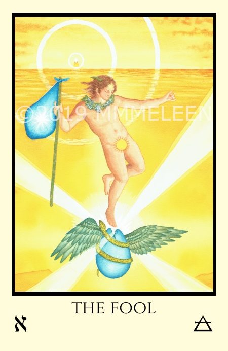
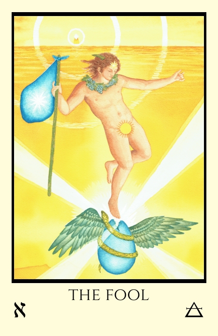
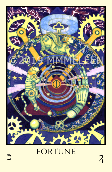
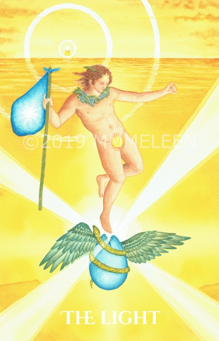
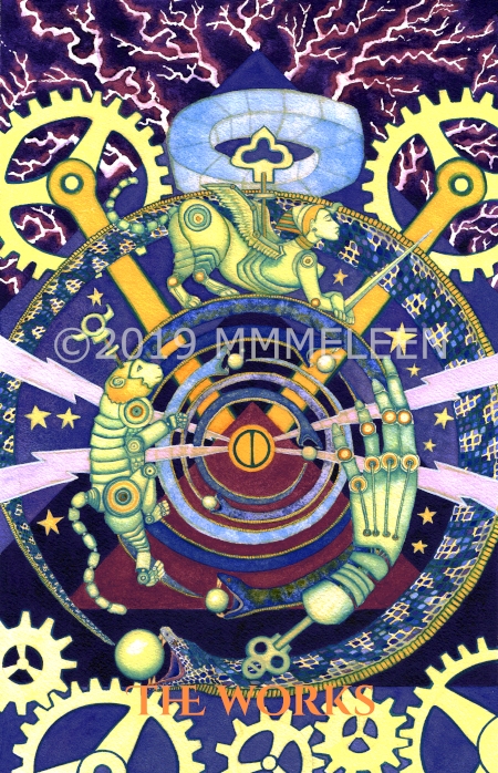
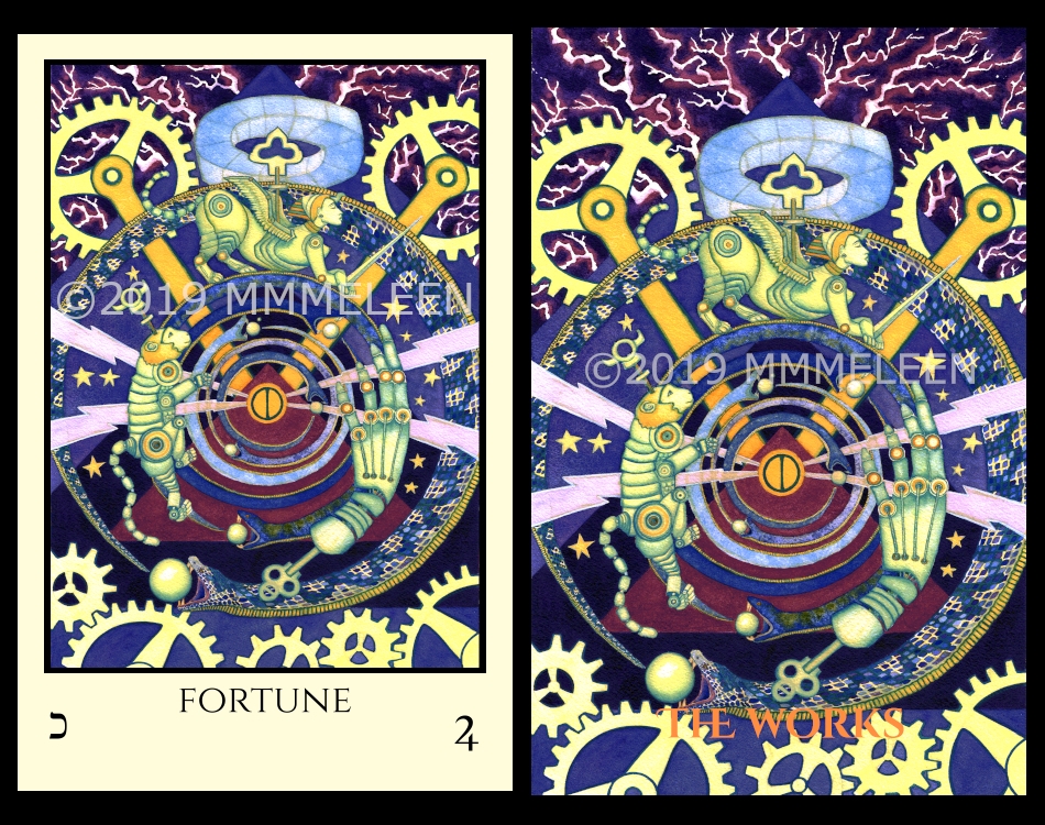
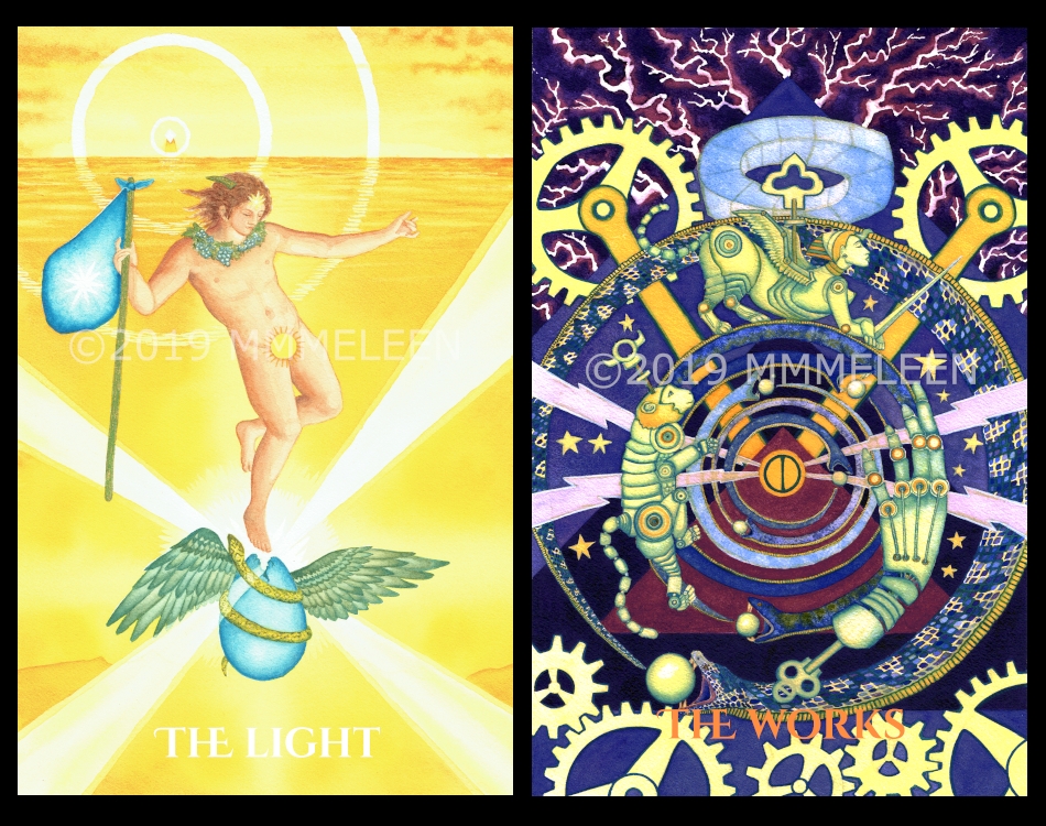
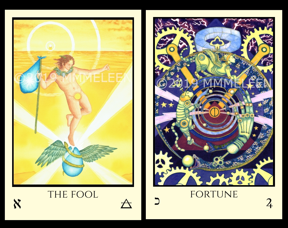
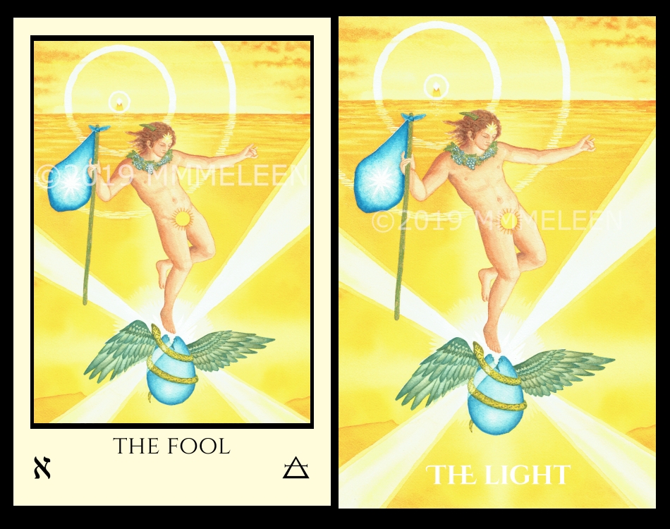
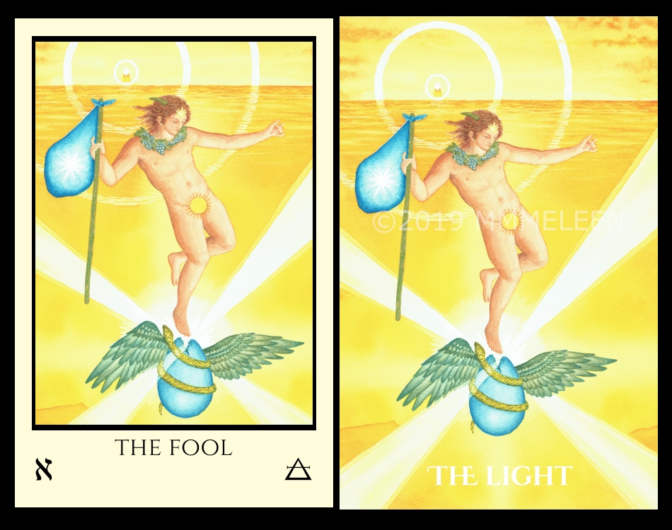
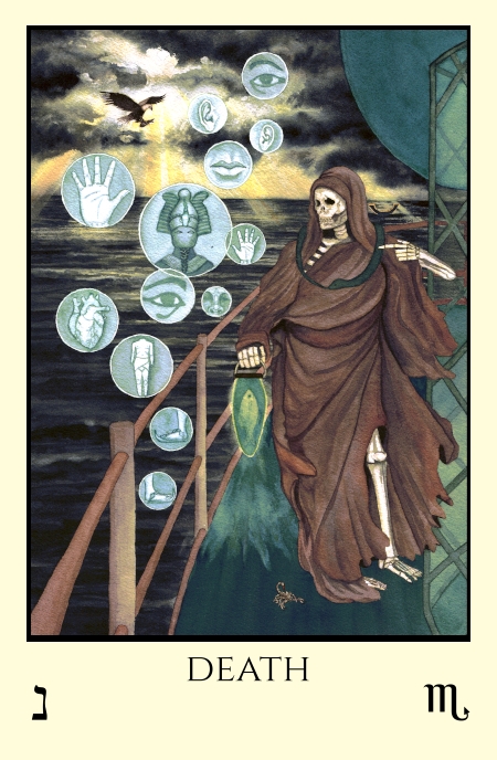
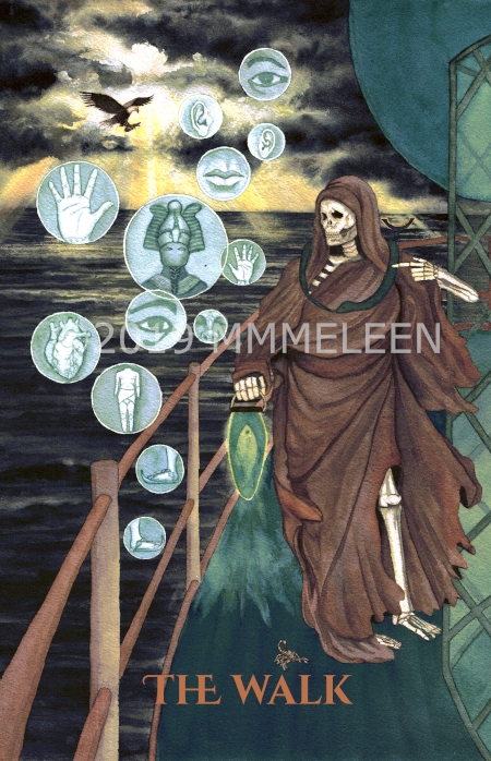
We also have to decide on traditional Thoth based titles or the alternate Pharos concept titles. (And whether or not Lust should wear the “Scarlet Woman” dress or be naked!) It’s a wonder anything ever gets done as I’m pretty indecisive sometimes.
To see the alternate titles check the Pharos home page.

I love the borderless one as you can see your MAGNIFICENT artwork. I am a beginner though, so it is more confusing for beginners to have the card without the traditional names and symbols. I would have to get both, one for me as a neophyte and one for me as I progress! Beautiful work!
I love the borderless, but would prefer the standard titles. The art is beautiful
Borderless, alternate titles, and naked. But they’re seriously gorgeous however the fine tuning comes out.
Sorry I’m so late to the party, but here is my two cents. I think there are pros and cons to both versions. Yes, with the borderless, the art has the freedom to really pop and therefore be on center stage -but it comes at the cost of drowning out the symbols and any titles you have. On the other hand, the border makes the card seem very professional and well put together -but can seem to box in the image in such a way as to make it less powerful (the viewer is at a distance rather than immersed). Maybe a solution would be to find something in between? I’m kind of thinking that a simple black border at the bottom (with the top and sides freed) would allow the image to pop as well as allowing the symbols/titles to remain legible. Another advantage of the black border is that it would also be a perfect background for any foil lettering. Just a thought.
I would buy both bordered and unbordered cards. Make two lust cards.
I would vote for Alternate Pharos titles but with a Roman number. Borderless deck looks good, but the material of the cards should be highly abrasion-resistant so the cards don’t get chipped at the edges.
And I hope someday you‘ll make a full 78-card Pharos deck. Your artwork is so great! But as a tarot-practitioner I need a full deck to do the actual readings. These majors are great, but what a deck it could be as a full 78-card version!
Wish you good luck and creative success!
Since you have already done decks using the Thoth titles, I would very much appreciate having a deck that has titles from you. As for borders or not, I’d get them either way, although I do think that borders provide another layer of creative design to accompany the choice of title font– that is to say, borders could actually accentuate the art. And naked Lust, all the way! 😉 Regardless of what you choose, I’m going to buy it! Thank you for sharing your art with us. <3
Oops! Although I voted boarded, going back I think I’d prefer the borderless with standard titles.
Borders are immaterial to me, I can take them or leave them.
Same with the titles – either or both is fine, though I do lean a little towards your titles.
As for the Lust lady, the dress and garter remind me of Deco era lingeree. I think it suits the style of the deck. But she’s traditionally naked, so why not include both?
I like both the borders and cards without the borders as well as long as they have the traditional Thoth titles. I would buy both versions but please give me the Thoth titles.
I don’t want to memorize new titles for cards 🙂
Ultimately I plan to buy whatever you decide to do, but my preference is for borderless cards with standard titles, although I agree that “subtitles” would be cool. I also prefer the naked Lust card.
I’d get both bordered and borderless, same with the titles too. I vote both ways.
Alternate titles! Considering this is an alternate design with a theme, it would be outrageous not to have the alternate titles! 🙂
Another comment from me 😉
I’d probably use the bordered deck as a go to and save the borderless for admiration and feel I’d need to keep it safe from getting messed up with use, just sayin.
As for titles I’d love to see your own titles on these maybe with Crowley’s as subtitles?? I think Lust looks better naked and not hiding anything…AND I’d truly love to eventually have minors to go with these incredible Majors just because I can go deeper when I use Majors & minors together. Are you going to put a countdown counter on your site for this deck? Pre-orders? XX ?
I love love love the art in this deck and how it includes symbols of the Hebrew letter correspondences. My preference in decks is borderless, but if you end up doing a version with borders, I’d probably get two and then cut the borders off one. Maybe other people would too. But that means not having as large a card for all the rich beautiful art. Then, on the alternate names — they are so evocative — and draw me more deeply into reflecting on and “feeling” the cards’ meanings! I appreciate your hard work and thought on them, and I hope you use the alternative names. Finally, on Lust — that red dress is everything!
Definitely prefer borderless. As well as standard titles, but the subtitles idea is intriguing. Either way, I’m looking forward to supporting this project, given the opportunity. Thank you.
I like the borders, however with borderless cards, the feeling of the artwork is stronger I feel. I would buy either though. I vote for a naked lust card! Do it!
I know the trend these days is borderless, but I think art needs a frame. For me, borders are the finishing touch and also makes it look like a deck of cards, which is what it is.
I usually prefer borders, but I think the borderless has an elegance that very much suits the artwork.
I would buy both border and non-bordered. I would not mind alternate titles if both were on the card, almost a subtitle. (Or italic text etc), but would not want to depart from having the Thoth titles.
Subtitles are a good idea – I may try a version like that too to see how it looks!
I voted for ‘Standard’ but upon further consideration, I’m quite intrigued by the ‘Alternate’ names. So while I can’t change my vote on the poll, please consider this comment as one vote for ‘Both’. 😀
I always thought I’d go for borderless, but, I think they really do look better with a (light) border. Oh and a big vote for your alternate titles. As to being dressed or not, nope, not going there. X
That reminds me, I need to add a poll for the titles too!